

If, years from now, my legacy is the guy that made a font based on the Stratos logotype, I would be entirely okay with that. After obsessing over the Stratos lettering for years, and then lamenting that there wasn't a good vectorized version of the logo available online, I started to create my own. Naturally, that led to creating more letters, and soon it became a full-blown alphabet project. It was winter, I was post-college-unemployed and living in a poorly-insulated apartment in Crown Heights, Brooklyn. I had just read through the House Industries hardcover non-stop; the book profiles a design studio that specializes in beautifully ornate and offbeat type designs, and it left me dying to create some kind of alphabet, mostly so I could create a slick poster to promote said alphabet.


It needs to be said that I'm fully aware I didn't invent the letters or the design – really, I'm merely an interpreter. I tried to research the original Bertone letters, came up with almost nothing, and saw an opening for this to be expanded on and continued. I started by just recreating the existing STRATOS letters and then experimenting with creating new ones. Just enough to make a few words that I thought looked cool – at this point I still didn't see it as a typeface project. When I started to study the STRATOS letters, they seemed random and chaotic. They all slant, but the S is completely different, and oriented sideways. It wasn't clear that every character follows a pattern, and that the rest of the alphabet is just a matter of unlocking the pattern and connecting the dots. Sorta like how they made Velociraptors from DNA fragments and frog embryos in Jurassic Park. It's a completely grid-based system.
I documented my progress to addiction-enabler and fellow Stratos-type enthusiast, Will Pierce, in a series several lengthy emails. The notes that follow are my observations I made while in the middle of the project.
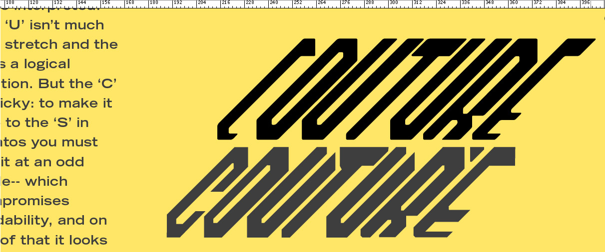
I went into this thinking it's a completely batshit insane lettertype. I actually thought, before I really started on it, that I could make two versions of each letter: a normal straight-edged italicized version and then a weird, against-the-grain other version (like the S) of each letter. So maybe, if you entered caps lock, you got the sideways one. I quickly learned that there is no way, and that instead of these letters being insane, they are as logical as possible. I've been looking at it too long, I suppose, but the S is sideways because that was just about the only way it could be done using only vertical, horizontal, and 45° [right-facing] lines. Well, I guess it could be made from the R, but it would be a stretch, and not at all interesting. And that's another thing— I'll take this as a lesson learned in font design: not all letters can be gems. Helvetica is one of the finest fonts around, but the I is just a straight line. I know, nothing earth-shattering there, but I think I've learned that it's more important how the letter fits with the rest than than how it looks on its own. Once the letters are part of a word, then they become infinitely more interesting because of the shapes they create between them. And this has never been more true than with the STRATOS type — any combination of letters creates mazes that you want to draw your way out of.


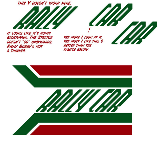
Figuring out how the letters should be shaped was sort of a puzzle. It required lots of thought and not that much art. Once I was satisfied with the shapes, I completely redrew them to be consistent widths and softened the harshness by rounding the sharp corners and generally refining it.
Ever hear of Christian Hrabalek, the Stratos collector and enthusiast? In addition to a number of those ultra-rare cars, he owned a lot of Stratos naming and intellectual property around this time, and had designed the much-hyped but never-launched Fenomenon Stratos project. As my typeface matured, I thought it would be really cool to reach out to his company and see if they liked it/were interested/wanted me to stop immediately. Before sending an email, I reached out to Will:
I want to run this by you. What if I named the font Altastrada? It [or rather, alta strada] means high road according to the internet. Hear me out. 'High' because it happens to incorporate the "high" from HF, while also coinciding with the image of the skies/upper atmosphere that the name Stratos naturally conjures. It brings to mind images of dangerous mountain passes while not limiting the possibility of the 'road' to tarmac, snow or dirt. It sounds well enough, is simple enough and even looks a bit like Alitalia at a glance. The two words themselves are very simple, but together have a greater meaning.
I emailed Bertone with no response. I'm not sure what outcome I wanted to see... a simple "It was designed by Luigi _____ in 1970, please cease and desist from what you are doing," would have been fine with me. But now I'm thinking I should email Christian Hrabalek and see what happens, since he very likely owns the rights. He is unquestionably very passionate about everything Stratos, but that could likely work to my disadvantage if he's very protective of his newly-acquired intellectual property. I'll definitely tailor a new email specifically geared towards him and see what happens – I'll keep you posted, and maybe even in have you look it over first.
Have you tried contact Hrabalek in the past? All I've got to go off is the generic info@fenomenon.com but it's worth a shot.


Although my lengthy emails of impossibly specific, inside-baseball font talk felt like they were going into a void, Will usually responded with some encouragement and some sort of indication that he read through most of it. Here was one of those responses:
You have refined the shit out of these characters. How many times have you done this before? That first graphic you sent him was absolutely incredible. I can tell just how much the House Industries book inspired you. Of course the question now is, where do you go from here? What next? Seriously, Altastrada (love the name, and that it has meaning) is fantastic.When I get home in a bit I will be playing, extensively, with the lettering. Lordy.

I got a positive response from Fenomenon (not Hrabalek himself). They encouraged my project and thought it was cool but didn't have much more interest in it and instead wanted to see if I'd create a version for their new Fenomenon Stratos that had dingbat diagrams of the modern car. They sent my some CAD drawings of the car and an Illustator file of some sort labeled "logo" that was corrupted. I wish I had a cooler ending to this but it sort of ended there: I started working long hours at an ad agency, I didn't have much interest in the Fenomenon vision of the Stratos, and at some point after this the Fenomenon company may or may not have stopped existing. (Does anyone know?)
I finished the font and ...that was it. I sent it few select friends who might be interested, and the finished font sat on my hard drive for a couple years, as well as being one of the most prized and unique items in my design portfolio [to this day]. Trying to sell it never interested me and seemed like it would open a whole can of worms. The chapter was over. Until last Spring, when my awesome friend Matt Hardigree ran one of my Monterey photos as a free wallpaper on Jalopnik. Some of the readers discovered the font on my website, and voiced that they wanted it in the comments. So, the following week, we offered it. How can you get it? Go here.
This was the best possible resolution. The font is widely available for everyone who wants it, and permanently lives in a post on what may be the most trafficked car site on the web. The most trafficked site among people who know what a Lancia Stratos is, surely. If you Google "Stratos font," this post is the number one result, and most likely will be for years and years. Forever associated with me. What could be better than that?


