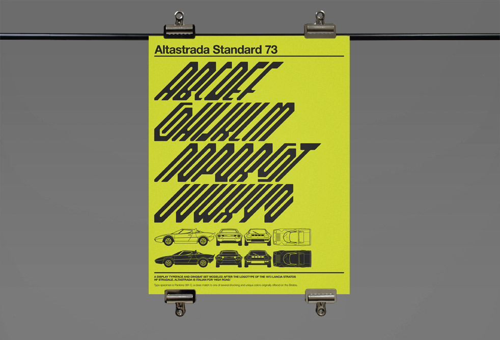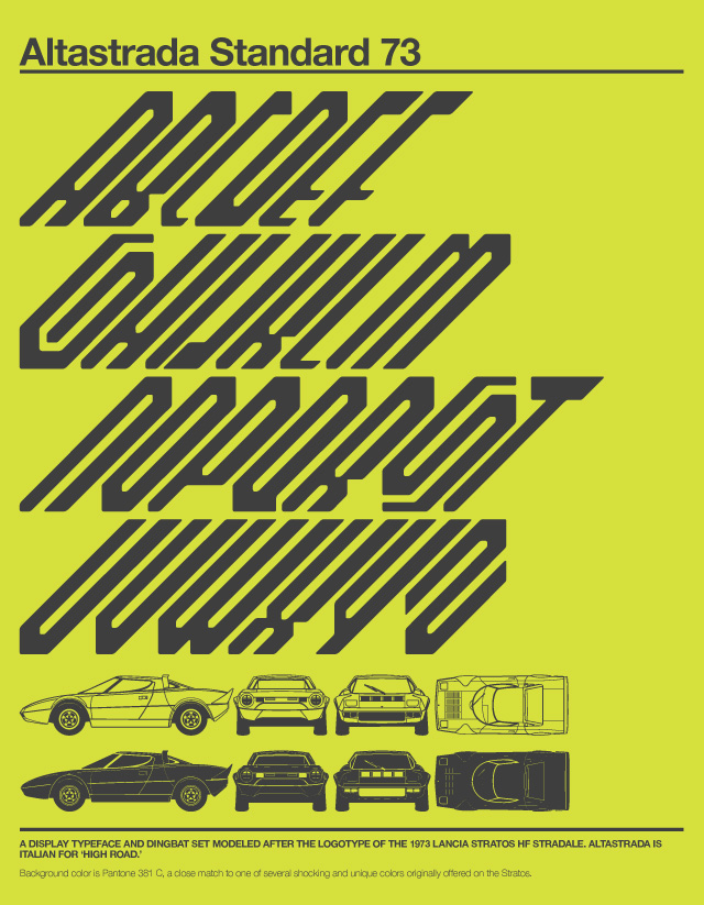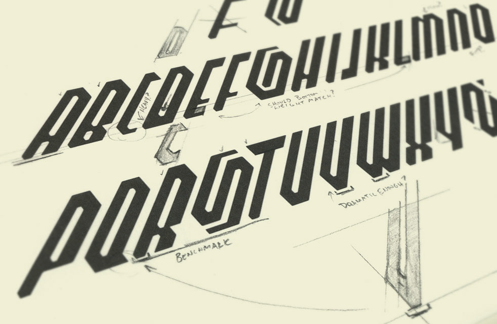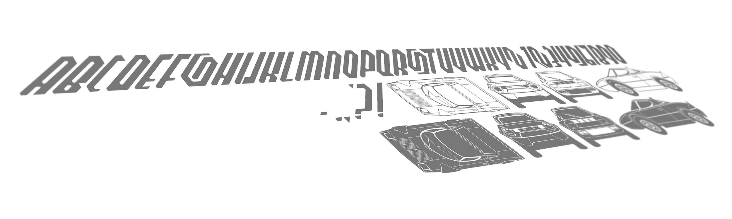
Altastrada translates to 'The High Road' in Italian, which to me is evocative both literally and figuratively of the 1970s European rally racing that inspired this font. It began as a type study, and turned into a full alphabet based on the Lancia Stratos logo typeface. It's a considered a display font, so it has the full alphabet, numbers and basic punctuation. The Stratos outline drawings at the bottom of the poster are included, and accessible by hitting the parenthesis, less than/greater than and the curly bracket and straight bracket.
As seen on Jalopnik. A more detailed step-by-step of this project can be found here.